01 · Project overview
A concept for coordinating everyday patient tasks.
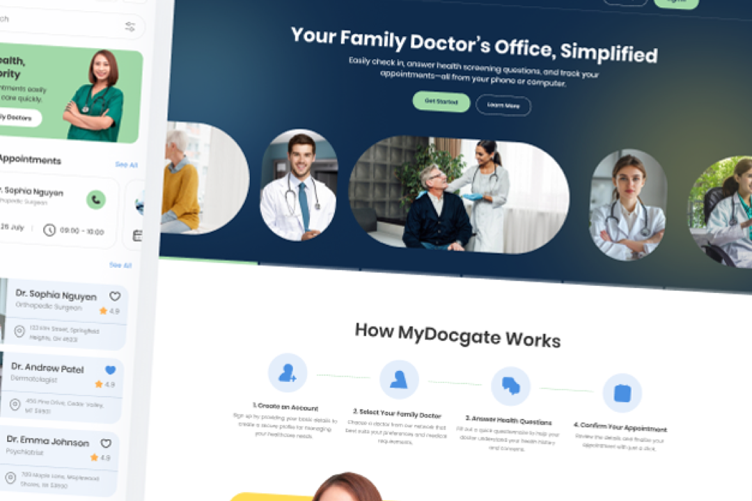
MyDocgate explores a connected web and mobile experience for doctor discovery, appointment scheduling, pre-visit questionnaires, and appointment management. The project is design exploration—not evidence of a production service or validated healthcare outcome.
02 · Concept goal
Bring common healthcare steps into one understandable journey.
The concept asks how patients might move from finding an appropriate doctor to selecting an appointment and preparing for a visit without navigating disconnected interfaces.
03 · Problem framing
Healthcare workflows can become fragmented quickly.
Search, provider details, scheduling, forms, and appointment status each carry different information needs. The design challenge was to organize these tasks into clear stages while keeping the interface approachable across screen sizes.
04 · My role
Concept definition through high-fidelity UI.
05 · Core user flows
Organize the product around a few clear tasks.
06 · Early wireframes
Start with task order before visual polish.
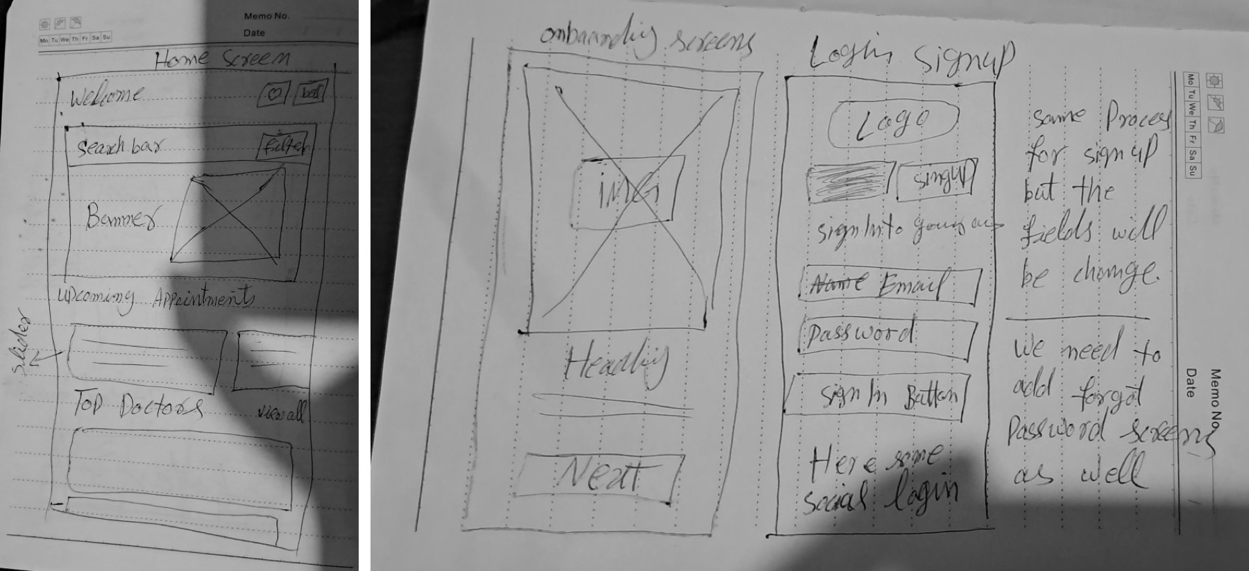
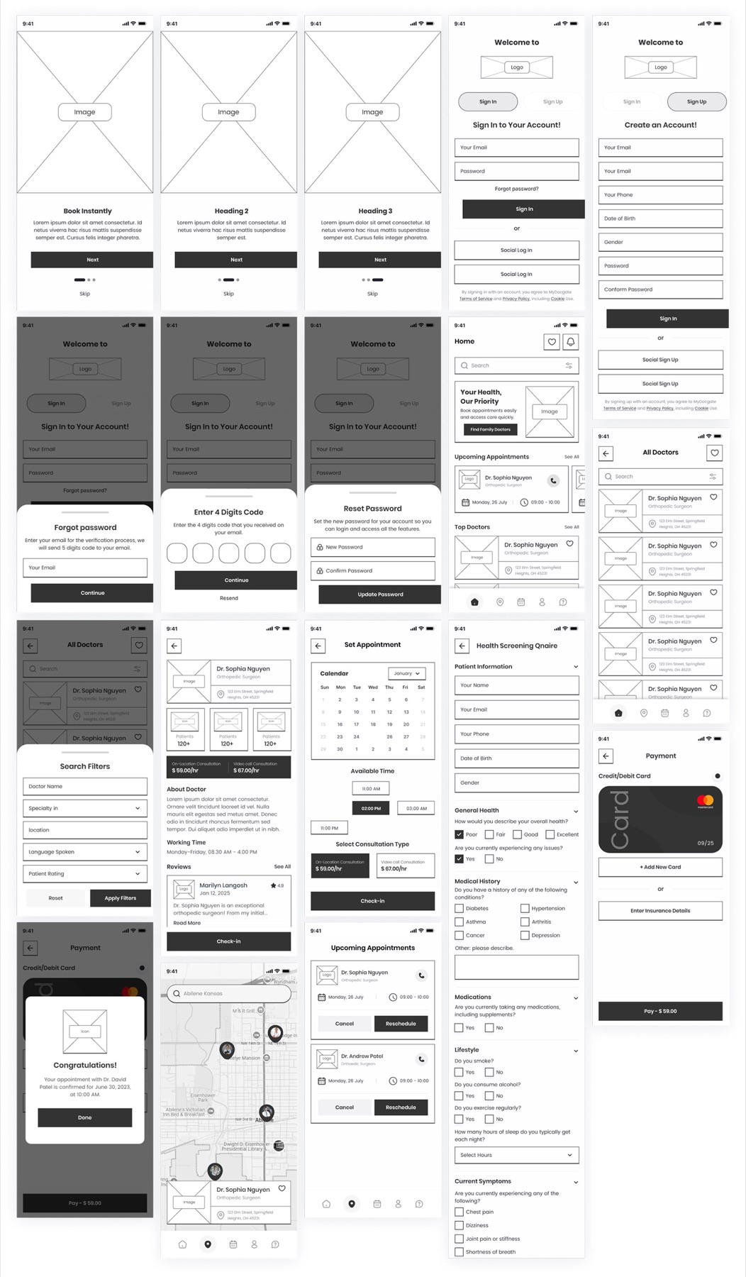
Paper sketches established the home, onboarding, and account patterns. Digital wireframes then expanded the system across doctor search, filters, provider details, scheduling, questionnaires, and appointment management.
07 · Responsive web + mobile
One product model, adapted to different contexts.
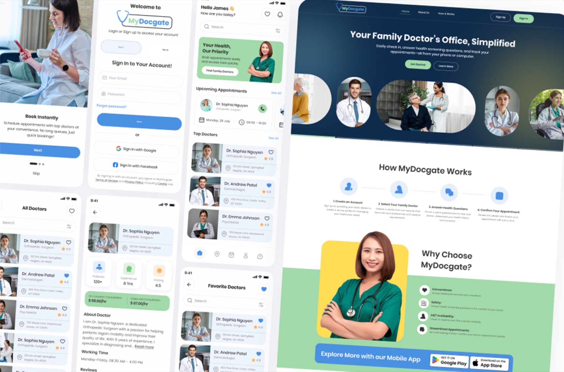
Desktop and mobile carry the same core tasks, hierarchy, interaction logic, status language, and flow progression. The web layout provides broader orientation, while mobile adapts the same model for immediate actions such as discovery, appointment review, and booking.
08 · Key UX decisions
Keep complex tasks visible and staged.
Progressive task flow
Break search, booking, and pre-visit preparation into focused steps instead of presenting every field at once.
Reusable provider patterns
Keep doctor cards, profiles, availability, and actions visually related throughout discovery and scheduling.
Persistent orientation
Use stable navigation and recognizable appointment states to help users understand where they are and what comes next.
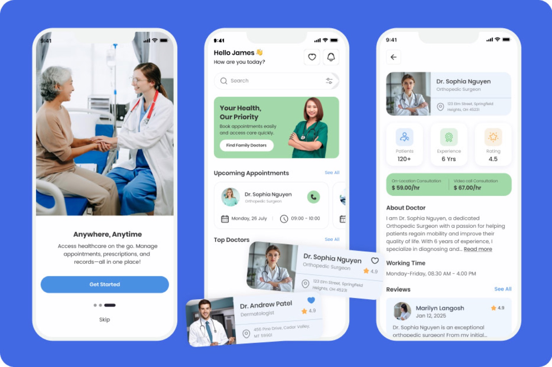
09 · Final concept screens
A connected mobile interface for discovery and preparation.
10 · Accessibility and usability considerations
Design considerations, not compliance claims.
- Readable type sizes and clear label hierarchy
- Large, recognizable primary actions
- Consistent patterns for forms, filters, and appointment states
- Plain-language task sequencing and visible next steps
- Color used with labels and structure rather than as the only signal
These are design considerations within the concept. The work has not been presented as accessibility-certified or validated with real users.
11 · Reflection / what I would validate next
The next step would be evidence, not more screens.
I would validate whether people understand the distinction between doctor discovery, booking, check-in, and pre-visit preparation; test the longest form and scheduling paths; review language with healthcare subject-matter experts; and conduct an accessibility audit before further product development.