01 · Project overview
A product concept for seeing financial priorities more clearly.
The product model connects a financial overview with focused areas for budgeting, goals, reports, and conceptual guidance. Progressive disclosure keeps the summary useful while allowing deeper detail when a task requires it. All figures and recommendations are illustrative interface content.
02 · Concept goal
Move from orientation to a focused task without losing context.
The concept links an at-a-glance dashboard to budgeting, goal creation, reporting, and optional guidance so each task feels connected to the same financial picture.
03 · Problem framing
Financial products can show plenty of data without creating clarity.
Balances, goals, spending, trends, and recommendations can compete for attention. The design challenge explored a clearer hierarchy that helps people identify what matters first without oversimplifying the information.
04 · My role
Concept definition through dashboard and mobile UI.
05 · Information architecture
Group information around decisions, not data sources.
Spending, goals, cash flow, priorities, and optional guidance were grouped by the decisions they support. This keeps related signals together while separating overview content from task-specific detail.
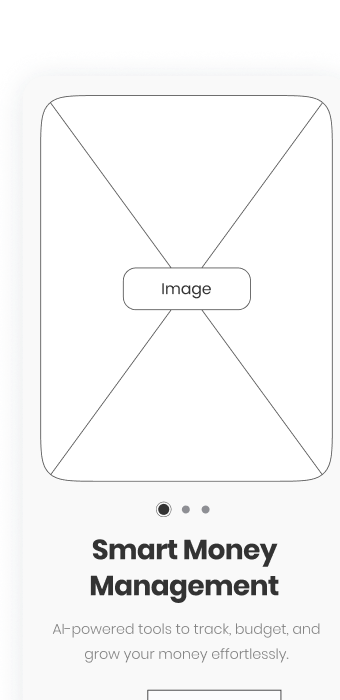

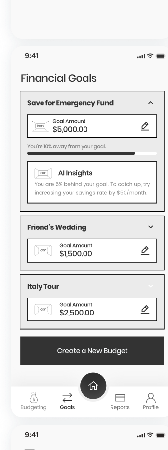
06 · Core user flows
Move from overview to a focused financial task.
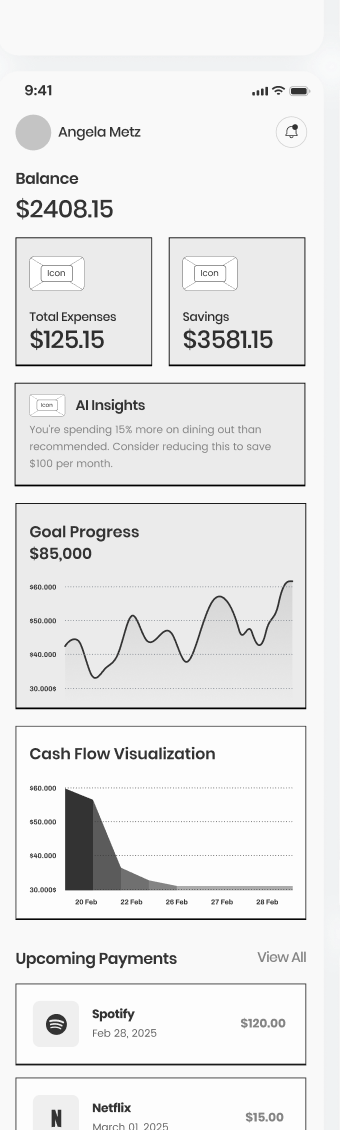
07 · Dashboard and data visualization
Prioritize the story behind the numbers.
The interface uses summary cards, restrained charts, progress indicators, and categorical color to separate balance, spending, savings, goals, and trends. The desktop dashboard extends the same hierarchy into a wider analytical layout.
08 · AI-assisted guidance concept
Guidance should explain itself and remain optional.
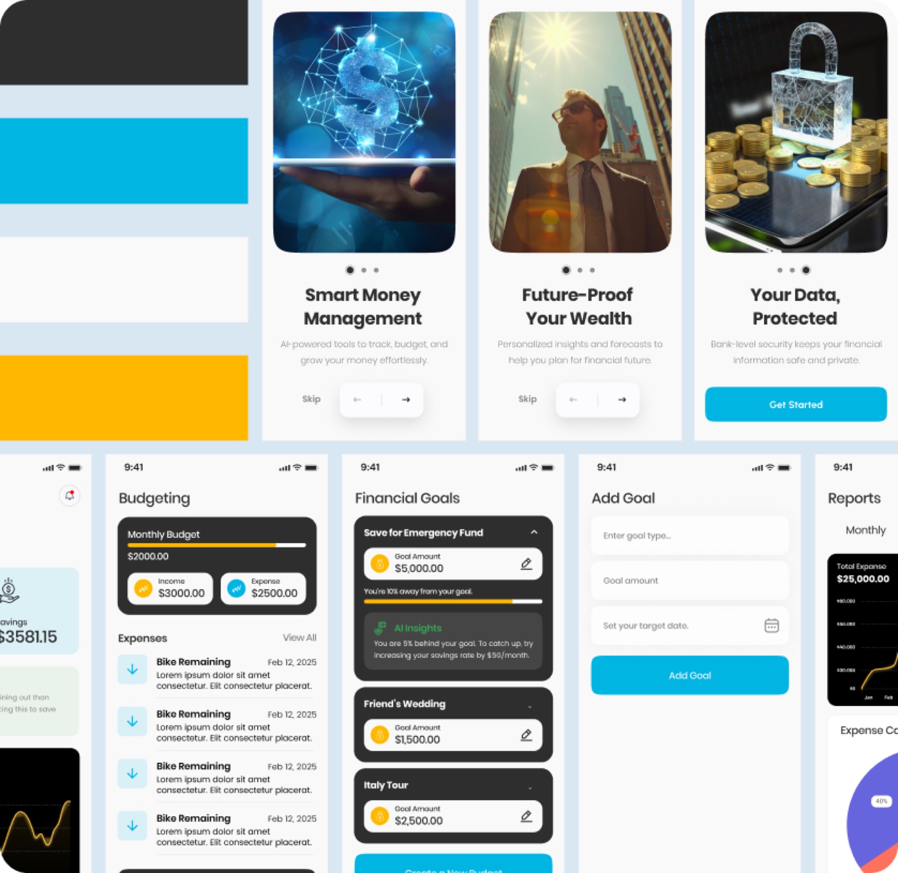
FinSage proposes concise insight cards and coaching prompts that summarize a signal and suggest a possible next step. These screens represent interface behavior only; no live AI model, recommendation engine, or real financial advice is claimed.
09 · Mobile-first UI system
Reusable patterns keep dense financial tasks familiar.
Repeatable cards, chart containers, goal modules, transaction rows, status treatments, form fields, and navigation create consistency across tasks. The visual system uses hierarchy and color to support prioritization, scannability, status recognition, and a clear separation between information and conceptual guidance.
10 · Key design decisions
Use contrast selectively and keep actions close to context.
Layered hierarchy
Lead with a small set of summary values, then reveal detailed trends and activity below.
Purposeful color
Reserve bright accents for categories, progress, and primary actions against a neutral interface.
Visible progress
Show goals and budget states with labels, values, and graphical indicators rather than color alone.
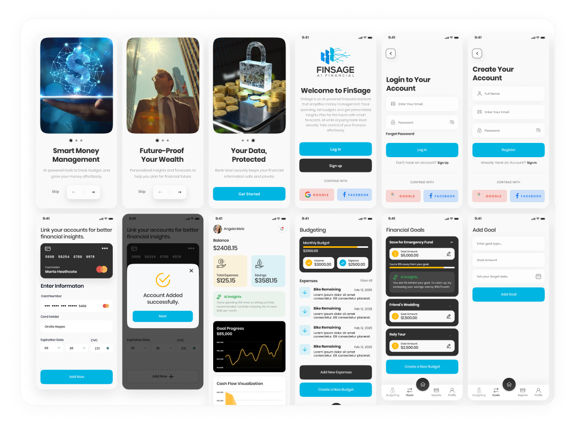
11 · Final concept screens
A broad mobile concept, curated as one inspectable system.
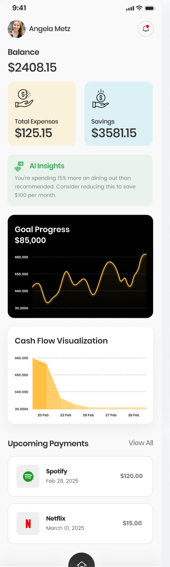
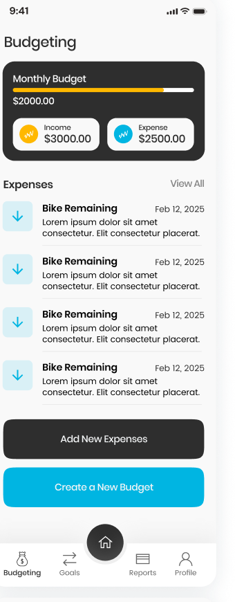
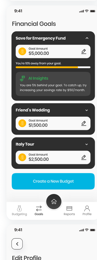
Concept UI only. Financial figures, alerts, guidance, account connections, and dashboard data are illustrative and do not represent live functionality.
12 · Future validation
What I would validate next
- Whether the financial hierarchy is understandable at a glance.
- Which dashboard signals deserve the highest priority.
- Whether optional guidance feels useful without becoming intrusive.
- How people interpret AI-assisted suggestions and their limitations.
- Which reusable patterns remain clear across different financial situations.