01 · Project overview
Commercial storytelling across landing pages and PDPs.
The work connected product education, benefit-led storytelling, comparison content, and shopping pathways across the StayStrong+ collection and supporting product experiences.
02 · My role and contribution
A focused visual-design contribution within a collaborative team.
I owned responsive layout work, UI composition, product storytelling, PDP imagery, visual hierarchy, and design execution across desktop and mobile.
Content direction, merchandising requirements, stakeholder feedback, and final approvals were collaborative inputs that shaped the work.
Scope boundary: this case study does not claim ownership of the full brand, campaign, copy, product strategy, research, or commercial results.
03 · The design challenge
Make dense product information easier to scan and shop.
I grouped benefits, supporting detail, comparison content, and calls to action into a clearer progression so customers could scan first and move into deeper product information when needed.
Orient, explain, compare, then help the customer continue.
This principle shaped content order, comparison moments, CTA progression, and the way dense desktop sections re-composed into a readable mobile sequence.
Make detailed product information understandable without oversimplifying it.
Preserve credibility through restrained hierarchy and consistent brand presentation.
Help customers identify benefits, differences, and useful next actions quickly.
Maintain hierarchy and readability as dense content collapses to smaller screens.
04 · What I designed
From page-level structure to product-detail storytelling.
Responsive landing pages
Desktop and mobile layouts combining product discovery, education, comparison, and shopping content.
PDP imagery
Visual modules translating product use, key benefits, ingredients, and supporting information into scannable stories.
Hero concepts
Multiple approaches balancing product, audience, headline, and action within the first viewport.
Supporting visual systems
Repeated type, color, icon, framing, and composition patterns helping related assets feel cohesive.
05 · Design approach
Design the hierarchy before decorating the surface.
Re-compose desktop sections for narrow screens while preserving readable type, clear actions, and product emphasis.
Give each section one clear job through staged headings, imagery, benefit summaries, and actions.
Use stable typography, spacing, and content patterns across varied product colors and imagery.
Treat product cards, comparison modules, education blocks, and PDP formats as repeatable structures.
06 · Selected visuals
The StayStrong+ landing-page system across desktop and mobile.
The mobile experience re-composes the same product story into a focused single-column sequence while preserving hierarchy, product emphasis, and clear actions.


OmegaGenics Fish Oil landing page

PDP and product-detail storytelling
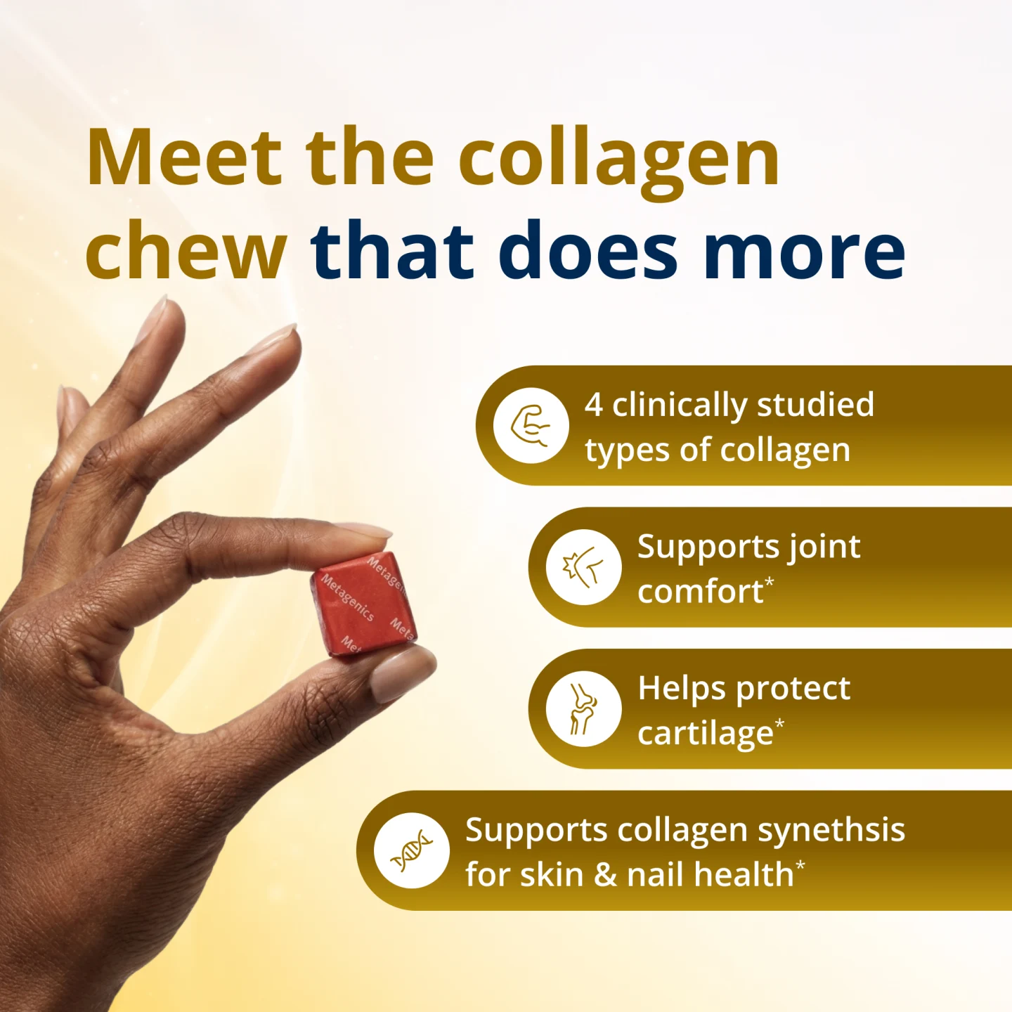
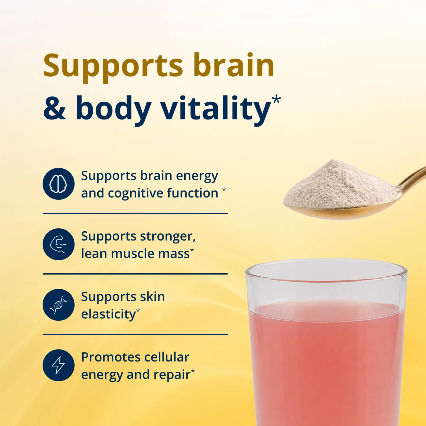
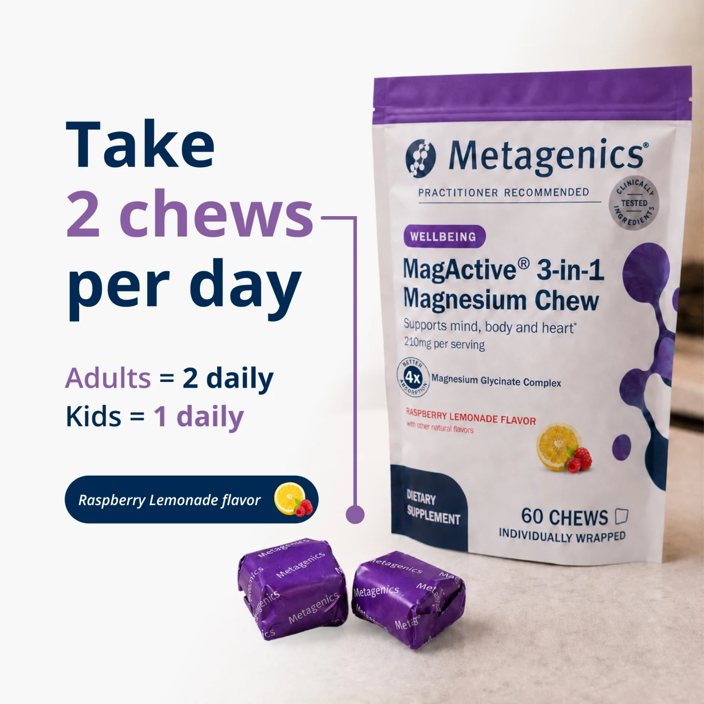
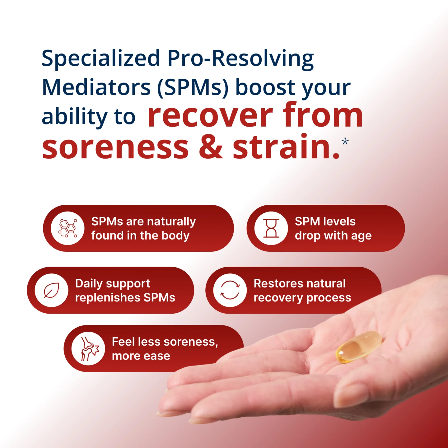
Design evidence only. Product language and claims belong to Metagenics’ public materials; no independent validation, campaign ownership, or business outcome is claimed.
07 · Qualitative outcome
What the design improved.
The work supported clearer product discovery and gave the team a more consistent way to communicate benefits, supporting detail, comparisons, and next steps across landing pages and PDP content.
- Easier scanning of benefits and supporting detail across devices
- Stronger continuity between product education and next actions
- Reusable visual patterns for related product experiences and launches
Client perspective
“Zeeshan has become one of our go-to freelance designers when we need work that maintains a consistent brand feel while still bringing a fresh perspective.”